In the age of digitalization, wherever you turn, you can see that most of the offline market has evolved into online marketing. The Pandemic also had its share in this great metamorphosis. The general public also prefers internet shopping to visiting physical stores. At their fingertips, people have access to anything they choose. Do you want to know the tips for designing a website layout? Follow the blog.
Get more marketing website reports from the video.
When clients search through websites in this internet frenzy to find what they want, businesses should have a visually appealing website. The success of your website design is determined by how spellbound your visitors are while using it.
“Design is the silent ambassador of your brand,” – says Paul Rand, one of the greatest American graphic designers. It can be well-attributed to a website design too. A well-designed website can encourage users to take action by fostering trust.
Do you intend to launch a new website for your company? It is not a herculean task to design a website. You are all set to go if you have creativity, an eye for aesthetics, and an open mind that is adaptable to innovation. Never forget to ponder over the best aspect of logo design on the website too.
Wait! Do you have a strategy? Before you start designing a website, make a plan. Planning ensures that your website is flawless. You may be aware that your website serves as an index for your brand. It is not easy to imprint your brand in the minds of your customers. Determine the purpose of your website first, and then proceed accordingly.
This blog will teach you the tips for designing a website layout as well as the benefits of having a good website and the drawbacks of a badly designed one.
Why Do You Require a Website?
Knowing the answer to this question allows you to decide how to design a website. In the following ways, a good website can be beneficial for your business. A good website
- Lowers the price of other forms of advertising media
- Gives limitless opportunities for product demonstration
- Gets free, incredibly useful feedback
- Provides clarity of the interests of prospective and recurring customers
- Generates business revenue through online sales
- Becomes a place for hiring and testing new hires
- Opens a way for offices to communicate private information
Now that you understand the importance of a website for your business or brand’s reach, here are some factors to consider when planning how to design a website and some tips for designing websites.
Know the Tips for Designing a Website Layout
Know the Purpose of Your Website
Every website has a goal. Determine why you are designing a website. You need to be aware of the type of website you want for that. Every type of website has a unique structure, components, color scheme, theme, and design. Here are a few different types of websites:
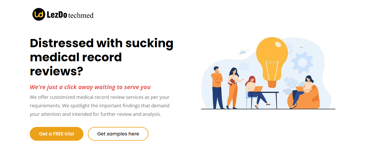
- Landing Page Website: It is a one-page website that can stand alone. It is like a business card for your company. A landing page website is any website that a customer can land on, but in the context of marketing, it’s typically a separate page from your homepage or any other page with a narrow focus. Your landing page allows you to exchange contact information in exchange for trade, special offers, knowledge, or deal. You can use them to market or sell a good or service, collect email addresses from customers, or choose specific types of clients to target. Its main purpose is the conversion of visitors to customers.
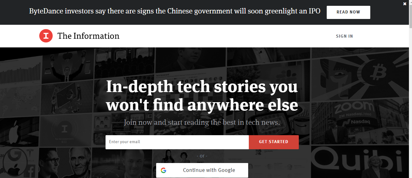
- Informational Website: An informational website is one that provides comprehensive knowledge on a specific subject, such as science, economics, or sports. This is designed to provide a personalized and standard resource for potential and current customers, members, information seekers, and so on. These websites are generally triggered by content and design.
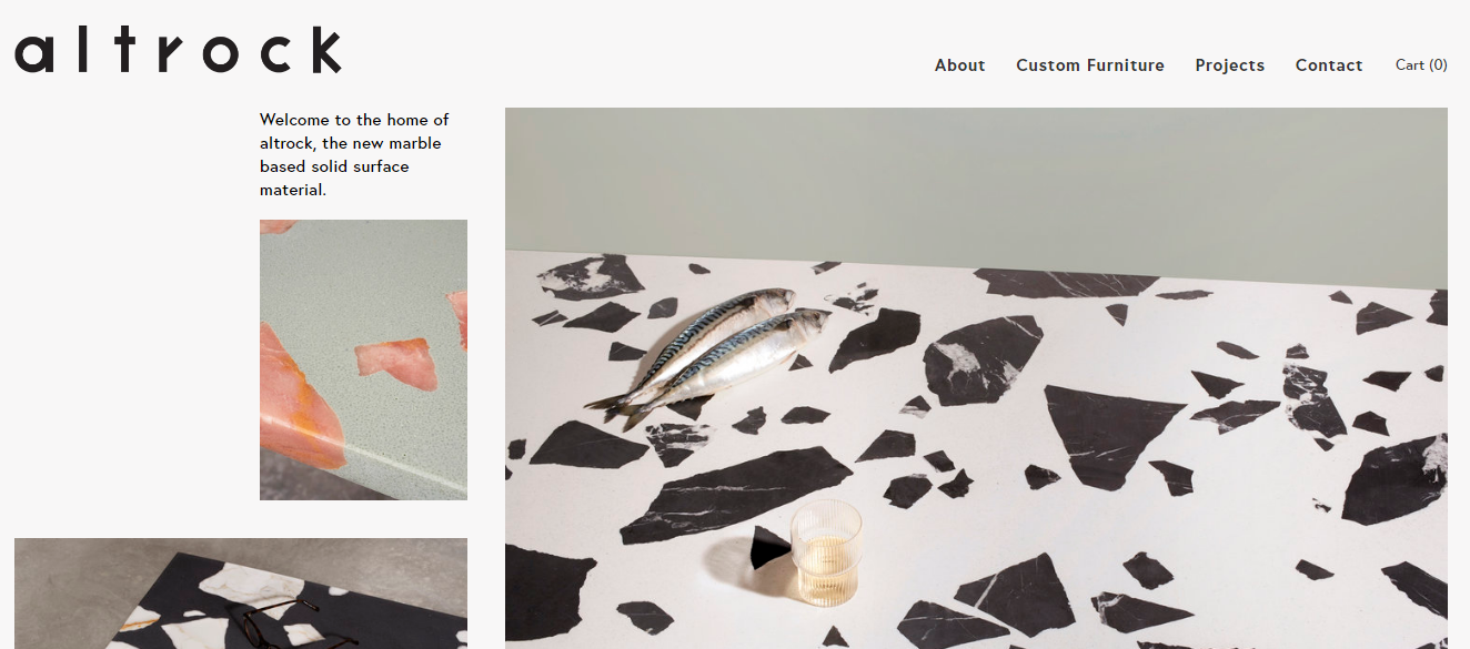
- Commercial/ Business Website: In this modern era, a company’s online presence has an indispensable impact on its success. Since many consumers visit as many websites as possible before making an in-person purchase, having an impressive website can increase revenue. A business website is an online platform for the sale of retail items, any type of goods, or products and services that become available for the general public to purchase.
- Educational Website: Educational websites may contain materials on a variety of subjects that can be used as teaching aids in the classroom. Nowadays, these websites help to keep learners entertained and interested in fascinating ways. It also assists students or learners in locating suitable courses in convenient locations, the ability to apply online, and the wide range of options for enrolling in such courses.
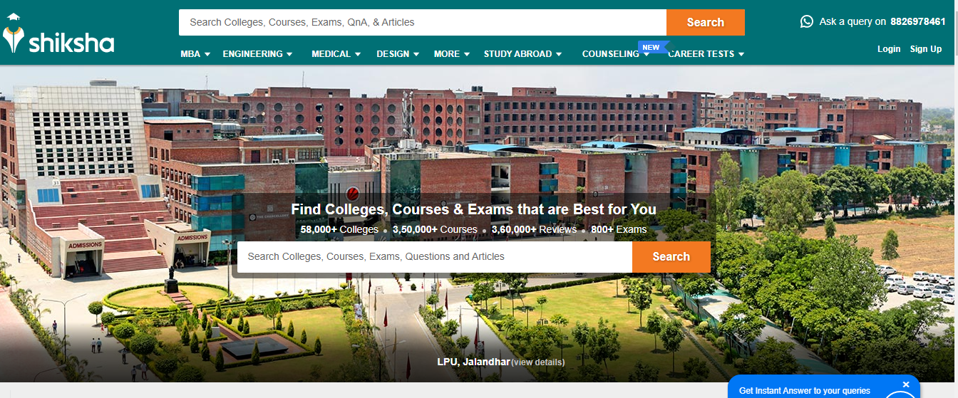
- E-commerce Website: A website that enables users to purchase and sell tangible items, services, and digital products online rather than in person. Through an e-commerce website, a company can process orders, accept payments, handle shipping, and provide customer service.
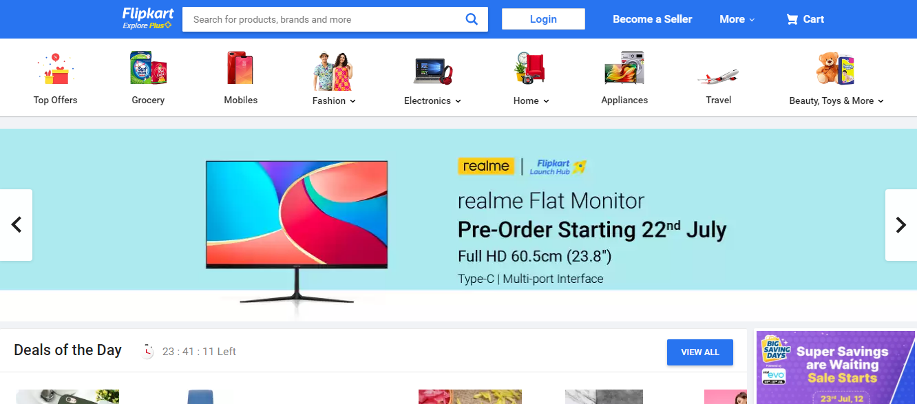
- Entertainment Website: As millions of people visit it just to have fun and find someone to have fun with, the entertainment website frequently includes more interactive elements than many other types of websites. Bright visuals, animation, entertainment-related content, interactive chat rooms, online games, photo galleries, drawings, audios, and videos, among other things, make it easy to identify an entertainment website.
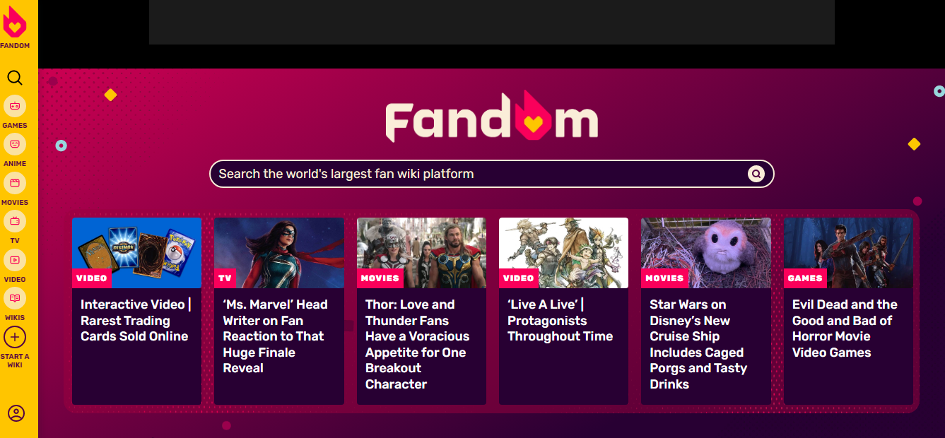
- Personal Website: Personal web pages are primarily used for information or entertainment, but they can also be used for personal career marketing, social networking with others who share common interests, or as a space for personal expression.
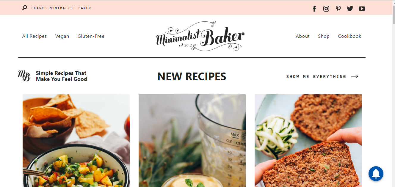
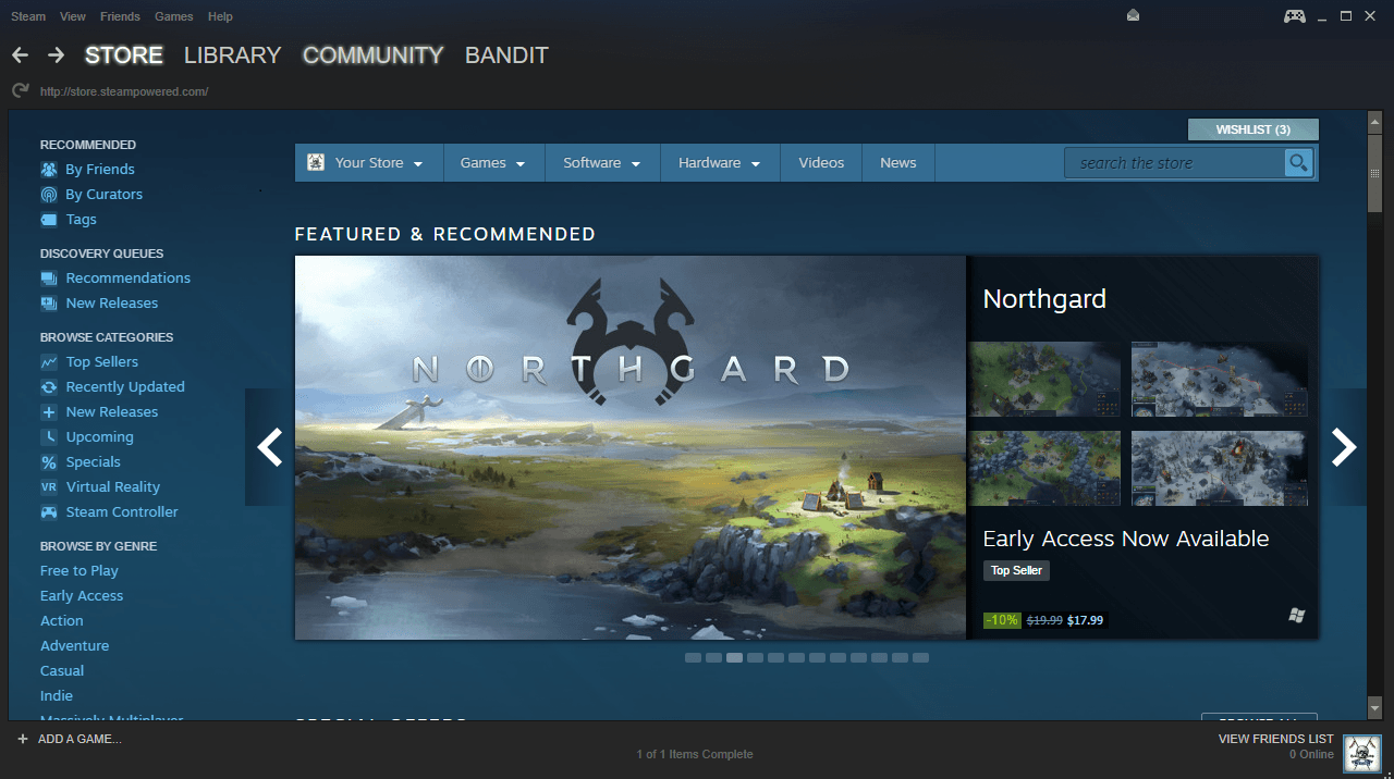
- Gaming Website: Gaming websites are made mainly to attract online gamers with all their innovative games and, in a way, make surplus revenue from gaming. These websites will be attractive with vibrant colors and pictures of the product to attract mainly young gamers.
Adapt to the Latest Trend
Researching the latest web design trends is an important step toward deciding how to design a website. In this fast-changing world, web designs are changing with the wind. In order to build highly effective, simple-to-use websites that work well and look amazing, we must stay on top of all the most recent trends in website design and development.
If you follow the old trend while designing your site, it will look outdated. Do you think people will even glance at a dull and old-fashioned website? Not only what you are going to sell be trendy, but the way your website appears also should be alluring to the visitors. Website design ideas can be found in abundance in the internet. Choose the best design ideas for the website or create your own trending template.
Choose Your Platform
There are a lot many website-building platforms available on the internet. Some might provide the basic features for free, and others are paid ones. Analysing them and cherry-picking the best will take some time, but that will be a worthy time spent. Some website builders are WordPress, Wigs, Hubspot, Weebly, Square Space, GoDaddy website builder, and so on. Try the free trial options to learn about the compatibility of the builder.
The criteria for choosing a website builder are easy to use, affordable price, customer support, available design and features, data ownership, and so on. Some of the website builders have in-built SEO tools, the option to use plug-ins and pre-made templates, and the option to customize your design that matches your brand.
Decide Brand Logo
Your website for the business is like your child. The logo is its name. So it should stand out from the crowd. Keep in mind the suitable color and the name of your business, and decide on a unique logo. The color and typography you are choosing should stick to the minds of the viewers. The logo should speak for your brand. The color of the logo will go along with the color theme of your site. Therefore, the color combinations should be like a couple in love- they should go hand in hand.
Simple But Appealing Layout
A study made by Google identified that users would decide whether a website is beautiful or not within 60 seconds of seeing it. Visually complex websites are considered less appealing. Complex websites will distract users and make them struggle to move to the other pages. This will increase the bounce rate. Easy navigation to the various components of the page makes the users stick to the page for a longer time.
Suitable Color Scheme
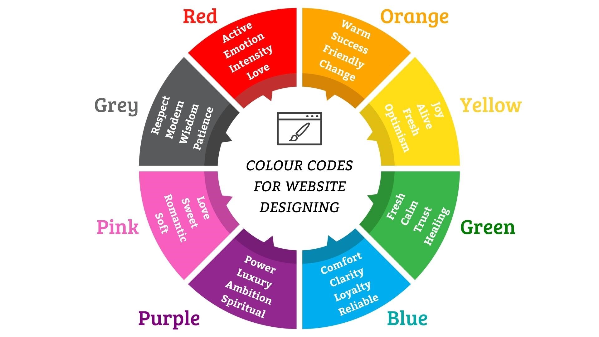
While each color can elicit a different emotion or reaction, some colors are more appropriate for the majority of brands and websites than others. Blue is thought to be the most secure color. When you recall most of the brands you know, you may notice that many of them are in blue. According to statistics, approximately 57 percent of men and 35 percent of women prefer the color blue.
I’m not suggesting that blue is the only appropriate color. Examine the image above to learn about the various emotions that each color conveys. Analyze the purpose of your site and select a suitable color palette. Use two or three different colors or different shades of the same color. Use as few colors as possible.
Mobile-Friendly
Many users depend on mobiles for surfing the net as it is convenient. Mobile-friendly websites can be easily accessible. Therefore, ensuring that your website is mobile-friendly enables users to interact and engage with your brand across devices without being irritated or inconvenienced. Your website should have bigger and more easily readable text, mobile-friendly buttons and navigational elements, and better download speed to make it mobile-friendly.
User-Friendly Experience
Knowing where to place each and every button, sign-up form, chat box, background data, and so on is very vital in making your website easily accessible and user-friendly. Experts say that many users won’t read the pages completely first. They tend to scan a page in an ‘F’ structure. Therefore, more legible content in an easily graspable format on the left side will help the users to understand what is on your website.
Instead of bigger paragraphs, easily skimmable short paragraphs can be used. Never show off your language proficiency in the contact forms. Contact or sign-up forms should be easily understandable, and confirmation of the submission of the form should be given in a message or pop-up. Avoid asking for unwanted and complicated details.
White Space
In the ecstasy of creating a website, never try to fill in all your creativity on the same page. Negative space or white space is something very inevitable in grabbing the attention of the users to the focus area. When over-crowded, the visitors will be perplexed to know the purpose of your site. If they don’t get what they come in for, they will leave the site immediately.
White space is used to balance the design of the page, organize the content and elements, and improve the user’s visual experience. Minor white space between lines, words, and sections around the logos and buttons, hero images, sidebars, and margins will improve the legibility and readability of your content. Finding the right balance in the use of white space decides the appealing nature of your site.
Unique Typography
Designing a website alone can’t make the visitors stay on your site. Typography is the collective term for the font, size, color, layout, and alignment of the material. The typography or the font must make the readers feel comfortable. Your website’s typography is essential for enabling visitors to read and comprehend all of its text-based content easily. Users won’t notice good typography on your website but will probably bounce off the page if it fails.
A good designer would choose serif fonts with sans-serif fonts to format his content. Serif fonts will look better in the body of the text, while sans-serif will make the headings better. Using multiple fonts and styles on the same page will make the page look awkward and not professional. The use of decorative fonts should be minimalized.
Content Hierarchy
The strategic arrangement of information on a web page in which the most important information is emphasized more than less important content is known as a content hierarchy. This frequently means that the most important information is at the top of the page and the least important information is at the bottom.
One of the best ways to guarantee that users will be able to get the information they need to complete their tasks is to employ a content hierarchy. It consists of a home page, top-level pages, and then subpages or child pages. Internal linking is possible; however, the website’s hierarchical structure benefits from a relatively straightforward top-down strategy.
Simple Navigation
The user is constantly kept in mind when designing user-friendly website navigation. Links to the most crucial sections are included, and the language is simple and easy to grasp. It uses a lot of white space, subtle color shifts, and other design elements to distinguish itself from the primary text.
If your website has a lot of pages, you should also structure your navigation using the main menu, second-level dropdown menu, and third-level dropdown menu. You have the option to prioritise the content you want website visitors to read using a navigation bar. It also helps you to guide your visitor around your website, starting with the most significant pages at the top left and ending with the less significant pages at the top right.
Engaging Call-To-Action
Calls-to-action buttons are meant to make the users engaged with your website. ‘Click here’, ‘sign up now’, ‘subscribe now’, and ‘call us now, are some of the call-to-action buttons. Do you want the visitors to leave your site without taking any action? All the efforts you have put into designing the website will go futile if no action takes place. The email database and contact list of a company can grow with the aid of the correct CTAs. For any firm, conversion rates are vital. Some CTAs are intended to turn site visitors into leads. Offering out gifts and free tickets will serve as clickbait to attract new clients.
Stunning Visuals
Visuals have a magical power to get imprinted on the minds of the viewers. They are around 400 percent effective and 60,000 times quicker in making the viewer learn the content and remember it easily. Glancing through your website for a few milliseconds will be enough for the visitors to judge your page. Your service and products might be impressive, but if you have a text-only website, it will not attract traffic or clicks.
Giving a visual treat to the visitors will make them pull to your website and tend to glance through your services and products. However, never use more full HD images, which would make your website loading time longer. Remember to compress the images. Instead of clamming your site with multiple vibrant pictures, be selective and use only a few on the main page. Appropriate images and videos give the users a quick and clear idea about what you want to convey.
Fulfill the Customer’s Goal
Customers should be able to achieve the goal of their visit to your site easily. Adding your sample works in the portfolio, crispy and informative background data, and a contact form will make the users know you more and contact you. These three things should be placed in the right place, easily accessible to visitors.
Loading Time
Think this: if you try to access a website and it takes a long time to load, will you be patient? Certainly not. As a result, optimizing page load time is just as important as designing an eye-catching website to keep visitors from leaving. If you want visitors to become customers, make sure your website loads quickly, and the visitors can find what they are looking for in a short amount of time. If you make sure of that, then a visitor-to-customer conversion is guaranteed. Two to three seconds is the ideal time for a website to load. Not many visitors will be patient for more than 3 seconds. They will leave the site disappointed.
SEO Boosting Elements
Everything you can do internally to improve your rankings is known as on-page SEO, which also includes optimizing your keywords, meta descriptions, title tags, alt text, anchor text, and website design. Off-page SEO refers to all external factors that affect the rankings of your website. Having all of these elements together in your website will boost up and make your site rank on the first page. It is said that if your site is in the top three positions, your website will get more CTR (Click Through Rate) and more traffic.
Since your ultimate aim is to get more traffic, making your website SEO-friendly is indispensable. Adding SEO-optimized blogs to your website will attract traffic to the site. The social sharing button will act like backlinking to your site. Backlink your website to high-ranking sites. All of these elements will help your site rank fast.
Get more insights from the given video.
Disadvantages of an Unimpressive Website
- Distracts the visitors: Innovative website designs can be impressive. But if you include the following unnecessarily and annoyingly on your website, then it will definitely reflect negatively on the number of visitors to your site.
- Auto-playing videos or advertisements: Videos or ads that play automatically will be a greater nuisance. If they have sound, it will surely annoy the users who want a silent observation.
- Blinking elements: Blinking texts or elements will be extremely annoying to visitors. It could disturb users with reading difficulty. It’s an awful idea to use the blinking elements based on usability standards.
- Chat widgets: The chat boxes that appear without the user’s intervention will be a huge distraction if it obstructs their view. The smaller the chat boxes, the greater the user experience.
- Horizontal bars: The moving horizontal bars can potentially hide vital text or content. The visitors might miss the text they need. It can be a loss to the advertisers as their efforts go in vain.
- Pop-ups: When the visitors come to your site, there should be time given to them to go through the content of your site. Instead, if pop-ups appear, blocking their view immediately after they come in, it will make them irritated.
- Longer navigation time: Too much time spent on a website in search of things will make the users depressed. Getting what they want without much navigation will be feasible for a good website.
- Increase in customer bounce rate: Poor loading time, difficulty in navigating the website, poor layout, unintelligible design, worst typography, and unsuitable colors can make the visitors feel irritated and leave the site. Studies report that around 95 percent of customer bounces are related to badly designed websites.
- Loss of customers and revenue: When customers find it difficult to use your website for their search or purchase, it will definitely reflect the loss of potential customers and loss of revenue. Recurrent visitors will be blocked by a website that is not user-friendly and mobile-friendly. This also will impact the revenue negatively. In an online business era, every mistake you make on your website will reflect your income negatively.
- Lack of updation diminishes visitors: A badly designed website might be your error. But it is better late than never. Revamp your website frequently. If you forget your website after publishing that, it won’t be trending after a few years and will become outdated. This will reflect in losing the old visitors, and there will be no flow of new visitors and traffic to your site.
To wind up,
Design is the backbone of your website. The content is its life, the appearance is its attire, and the loading time is its life. All businesses will need impressive websites to survive in the digital era. If your website does not keep up with the pace of the changes in the digital world, you will be left behind. Pick the top 10 website design tips to step towards your success. Design a mind-blowing website and reap success in the form of lucrative revenue.
These tips for designing a website layout will help you even when you start designing blog websites.
Hope you have understood the tips for designing a website layout. If you think designing a website needs the aid of an expert web design company, LezDo techmed is there for your help. If your business is big or small, you will be enthralled to see the works of LezDo. As a digital marketing service, LezDo has vast experience in creating websites that allure visitors to spend time on them. Have a glance at Ad Vantage site to know the quality.
Let’s meet in the next blog on the website-building platforms soon…
Never stop to seek perfection.
Follow us on Instagram for more updates.
View this post on Instagram
